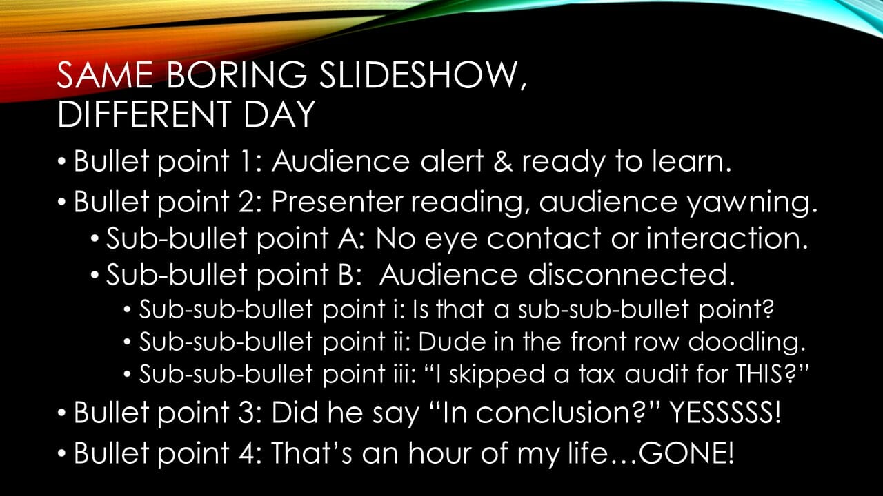
Audiences Come Alive!
Do your eyes glaze over at the thought of sitting through another drab PowerPoint presentation? Is your own audience petrified by what dullness might be lurking behind your title slide?
When I ask audiences if they would prefer a slideshow or an informal discussion, hands down, they welcome an old-fashioned chalk-talk over a technology-driven slide presentation.
What’s going on here? Why does the technology that once awed students now inspire dread and fits of yawning?
Let us blame neither the hardware nor the software; both have come a long way. I have been privileged to teach in some technologically-advanced classrooms, and the presentation software offers increasing levels of cool with every update. Why, then, have slideshows become thoroughly uncool?
Below are four reasons I believe workshops today are frequently lackluster. (I must confess, however, that I have committed slideshow sabotage in each of these ways during my career.)
1. Letting your slide deck be a crutch. Too often, presenters [believe they can] eliminate preparation time by leaning on their slides. They create slide after slide of laundry lists in bullet point format, believing the material on-screen will keep them both organized and versed in the workshop content. However, such laundry lists are presentation killers, as audiences neither want to read the entire content, nor do they want to observe the presenter doing so.
2. Reading your slides, word for word, bullet point by bullet point. This jeopardizes your credibility, and it egregiously ignores critical learning-style theory, namely that most students cannot both read and listen to the speaker. Moreover, by reading or excessively referring to the slides, the presenter is starving the audience of the very thing they crave most: eye contact!
3. Overusing the almighty bullet point. Ultimately, slides anchored by an endless column of bullet points will evoke such varied audience reactions ranging from bored eye rolls to screams of terror and desperate evacuation from the classroom [author exaggeration]. Rarely will the offending black dot—or what follows it—open a wellspring of excitement or enthusiasm within the audience. In other words, people have no further tolerance for bullet points.
4. Delivering massive volumes of data plastered across every bit of useable slide space. When text is so dense that the slide font is smaller than the lettering on a business card, then the point of a slideshow—to capture attention, to entertain, to educate—has been missed entirely. This unfortunate tactic also fits the critique above, namely that the audience and presenter spend their time reading slides and neither is communicating with the other.
Here are 3 concise tips—totally free of bullet points—to help you create a dynamic, interesting slideshow and to avoid having your audience sprinting for the nearest exit:
Do: Use BIG fonts, few words, and interesting graphics that coincide with your speech. If you are using a preexisting slide deck, hide cluttered slides and/or regularly press “B” while presenting to blacken the screen. This will shift the students’ eyes from the screen to you. (Press any button to resume the slideshow.)
Do: Keep slides concise and distribute handouts – especially when conducting training that requires the dissemination of significant quantities of information.
Do: Rehearse your presentation so many times that you rarely need to glance at the slides and, instead, may spend the majority of time focusing on your audience.
Stay tuned for a follow-up blog post discussing a simple process to build a presentation from inspiration to delivery. Until then, use the comment block below to share your feedback.
What are some of the best and worst presentations you ever witnessed? What made them memorable?
Guest Contributor: David Kershberg, AFC

Leave a Reply